Checkouts
. Brief
A good checkout cuts friction, lifts conversion and builds trust. I benchmarked PayMongo’s checkout against the best, audited it, and tested it with merchants — pointing the way to a simpler, mobile-first flow.
- Role
- Principal UI designer on the audit; product and UI/UX design
- Team
- 2 product designers, 2 UI designers, 3 engineers, 2 QA, 1 PM
- Timeline
- Discovery 2–3 days, audit 3–5 days, testing 7–10 days
- Methods
- Competitor analysis, UI/UX audit, moderated tests with 6 merchants
. Benchmarks
What the best checkouts do.
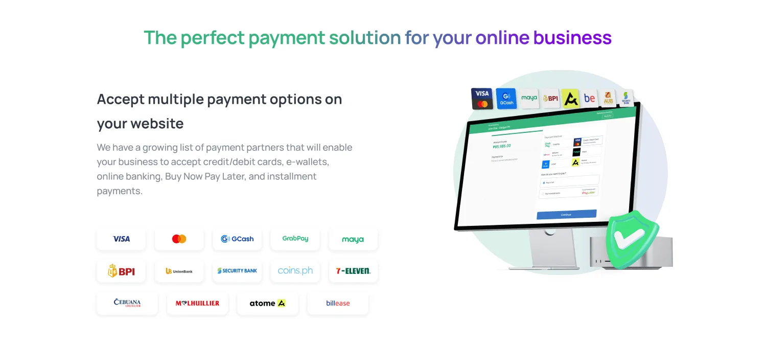
I studied competitors and non-competitors, including Lazada and Shopify — their carts, shipping and payment options, and order confirmations.
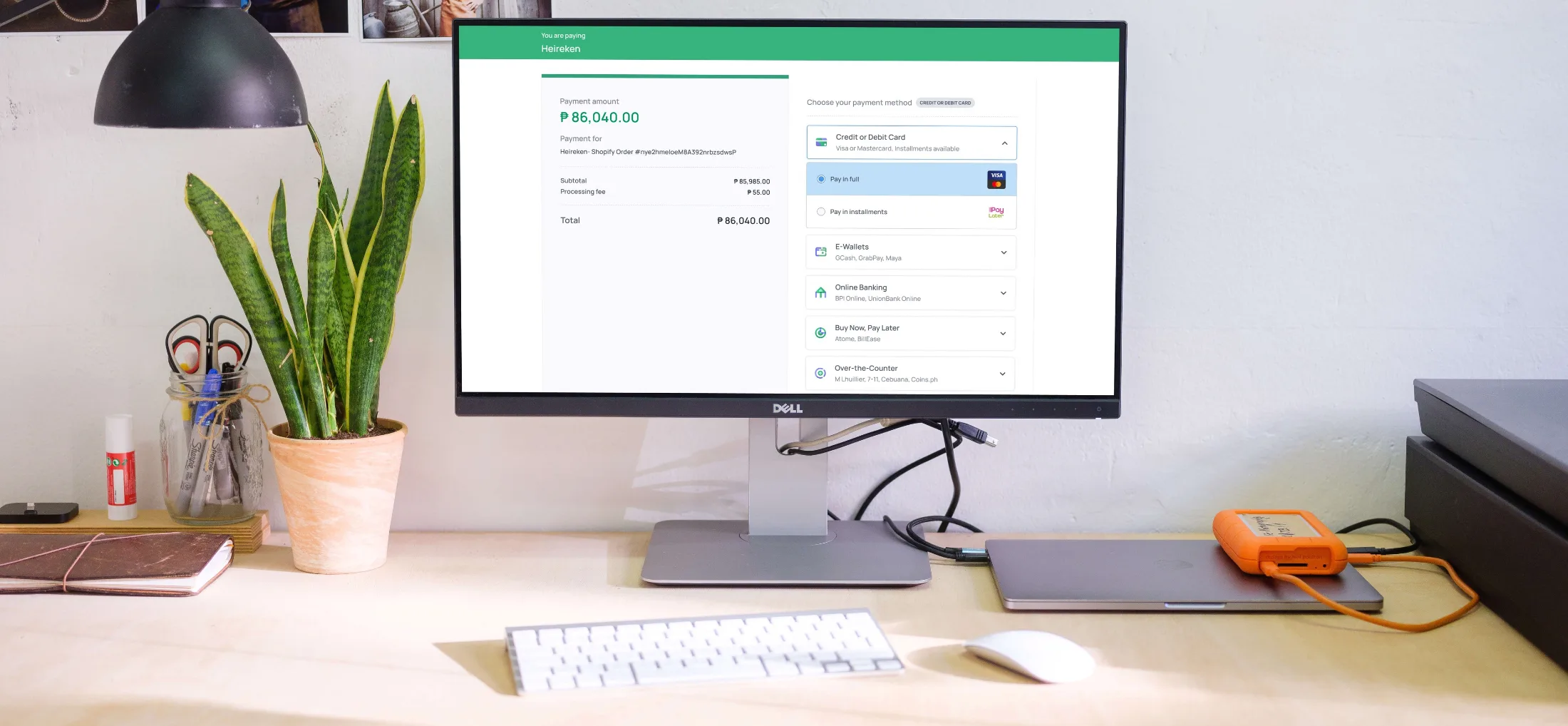
- 01Clear hierarchy.Every fee — subtotal, VAT, processing — before the total.
- 02An organised summary.A prominent total, simple labels and visible shipping and tax.
- 03A friendly layout.Familiar icons, easy scrolling and related details grouped together.
. The audit
Six things to fix first.
- 01Cut the clutter,especially in billing details.
- 02Show the chosen methodas clearly as the one being hovered.
- 03Disable the buttonuntil required fields are done.
- 04Standardise the details:weights, subtext, asterisks and tooltips.
- 05Write errors people understand.No technical jargon.
- 06Make the way back obvious,with clear calls to action.
↳ Six, not sixty. An audit is only useful if a team can act on it this sprint.
. Usability test
Six merchants, one clear direction.
- 01Mobile was hard.People wanted a shorter process on their phones.
- 02Cards took longest.Fewer fields would help.
- 03Payment options blurred together.Logos make them easy to spot.
- 04Repeated summaries confused people.One summary is enough.
The recommendation: go mobile-first and reorder the fields.
. Next
Case study 04
One desk for brokers, many insurers. ↗