Broker Portal
. Brief
Brokers juggle hundreds of active cases. The old portal had inconsistent styles, tangled workflows and no shared design system. I rebuilt it on a foundation new insurance clients can adopt without a redesign.
- Role
- Product design, UI/UX
- Team
- 1 product designer, 3 engineers, 2 QA, 1 account manager, 1 PM
- Client
- CoverGo, for global insurers
- Scope
- Login, dashboard, enrollment, design system, demo layer
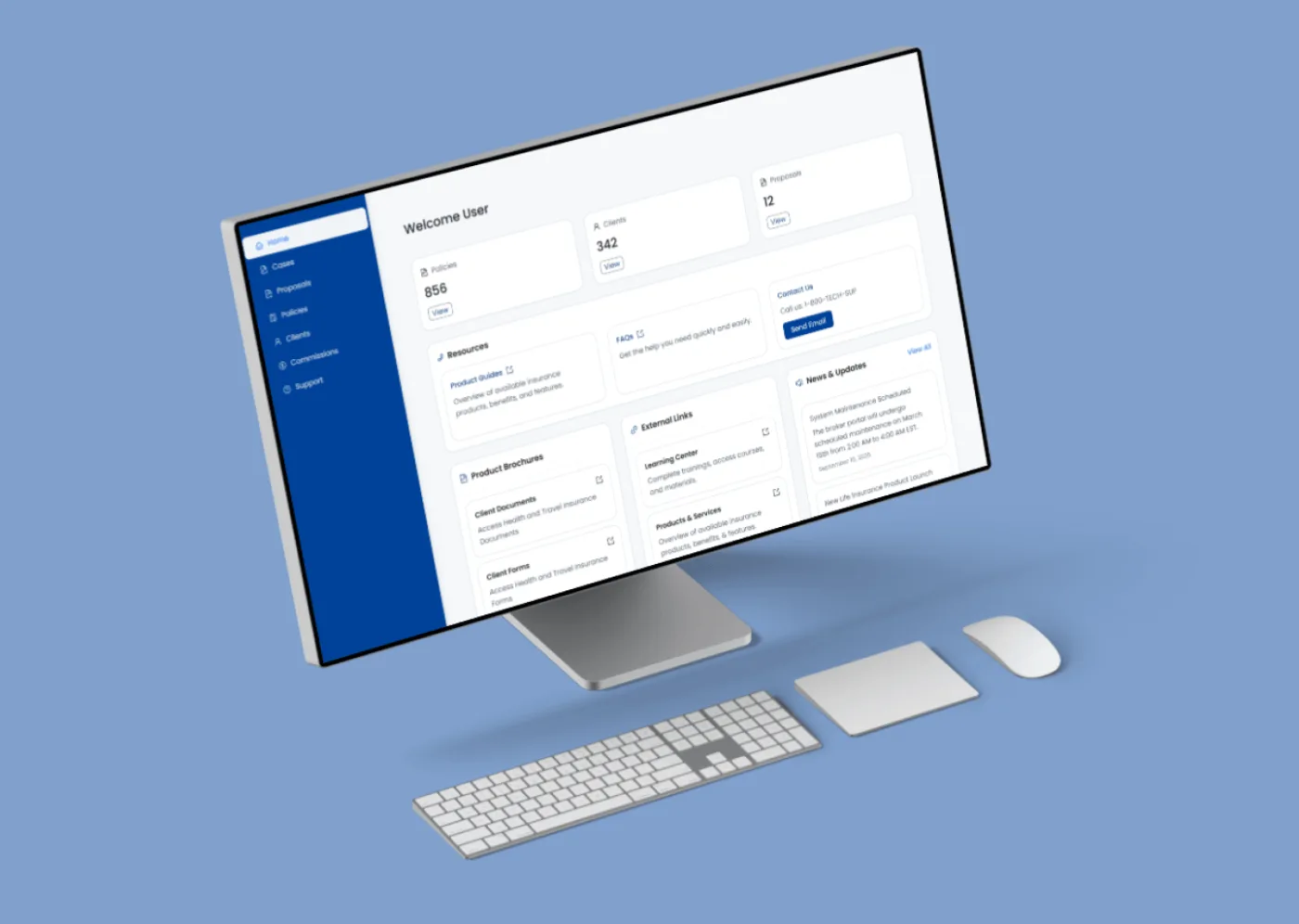
. What changed
- Faster
- Sales demos, with less design help
- Self-serve
- Sales handles most demo branding on its own
- One system
- Shared components across CoverGo portals
. The problem
Hard to read. Harder to scale.
- 01Outdated, inconsistent styleswith no clear type hierarchy.
- 02Complex workflowsand weak navigation across hundreds of cases.
- 03No shared design system,so every new client meant rework.
. Login
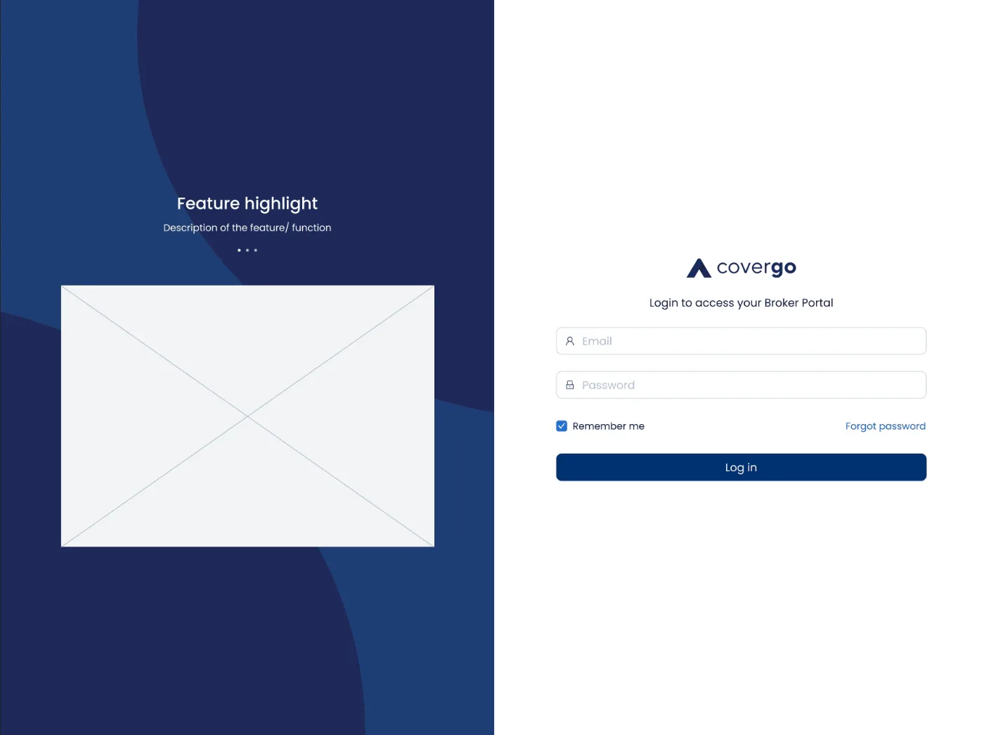
A front door each insurer can own.
A split screen: a clean, minimal sign-in on the right, and a white-label panel on the left that clients fill with their own headline, copy and images — no designer needed. Errors show inline, right at the field.
. Dashboard
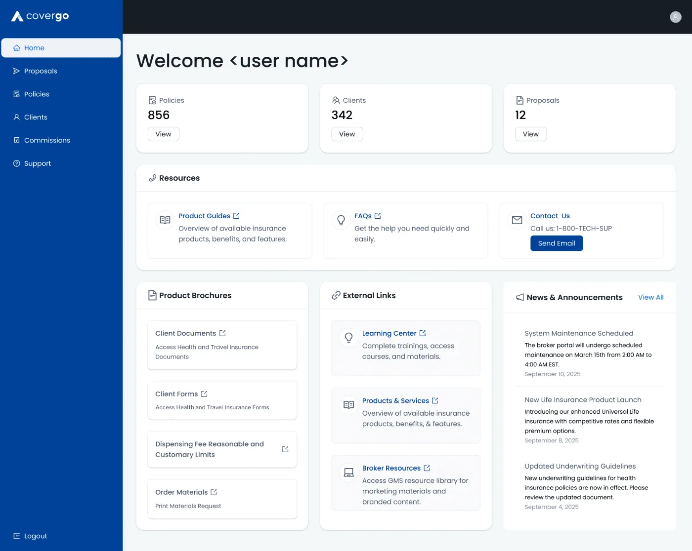
Portfolio health at a glance.
Policies, clients and proposals up top, with product brochures, useful links and news underneath.
. Forms
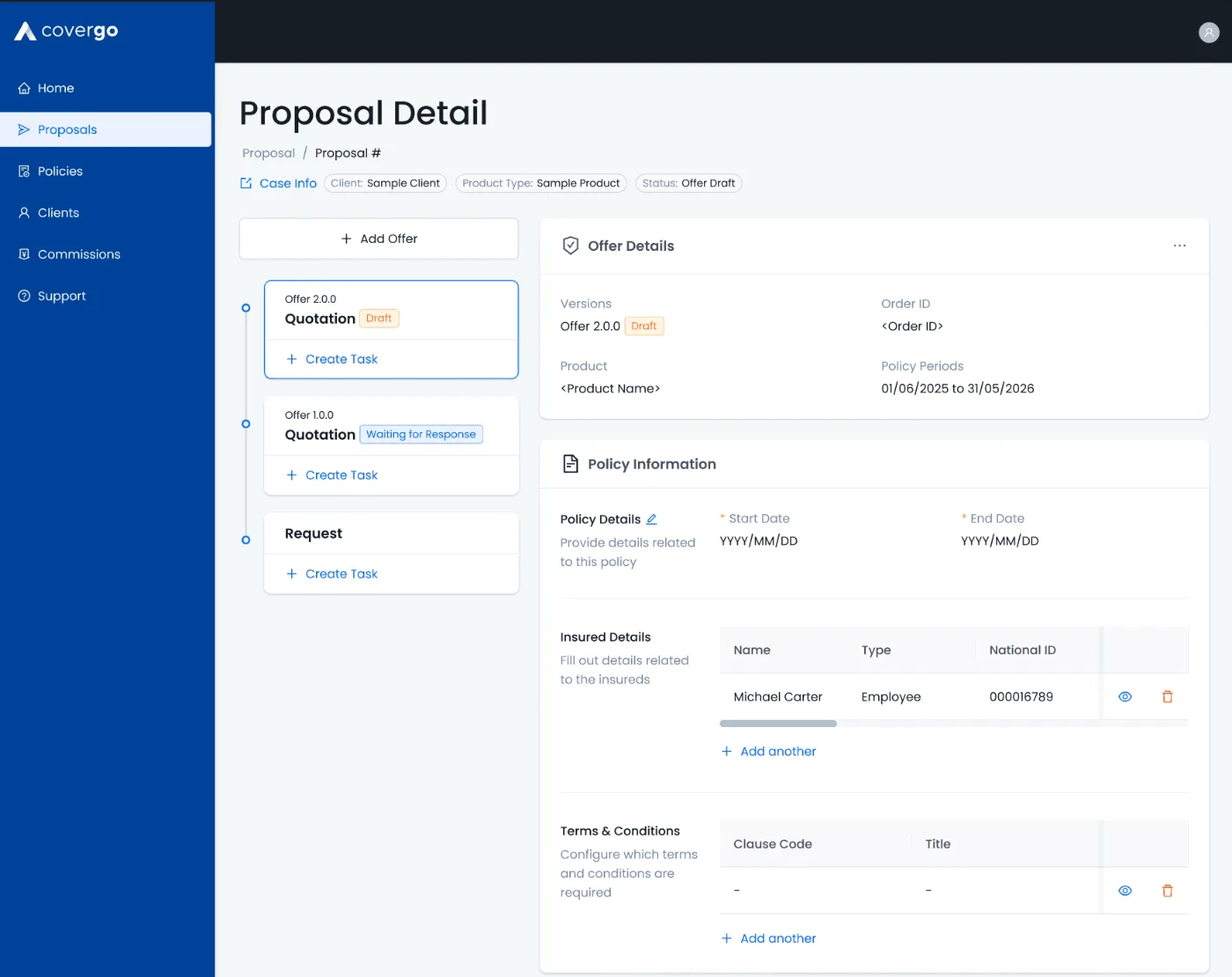
Ask only what’s needed, when it’s needed.
Enrollment once showed 15+ fields at once. Now fields appear based on earlier answers, in a calmer two-column layout.
On top of the production designs sits a themeable demo layer, so sales can re-brand colours, logos and type for each pitch.
↳ The system is the product here. The screens are just the first things built with it.
. Next
Case study 01
Inclusion through interoperability. ↗