Capital
. Brief
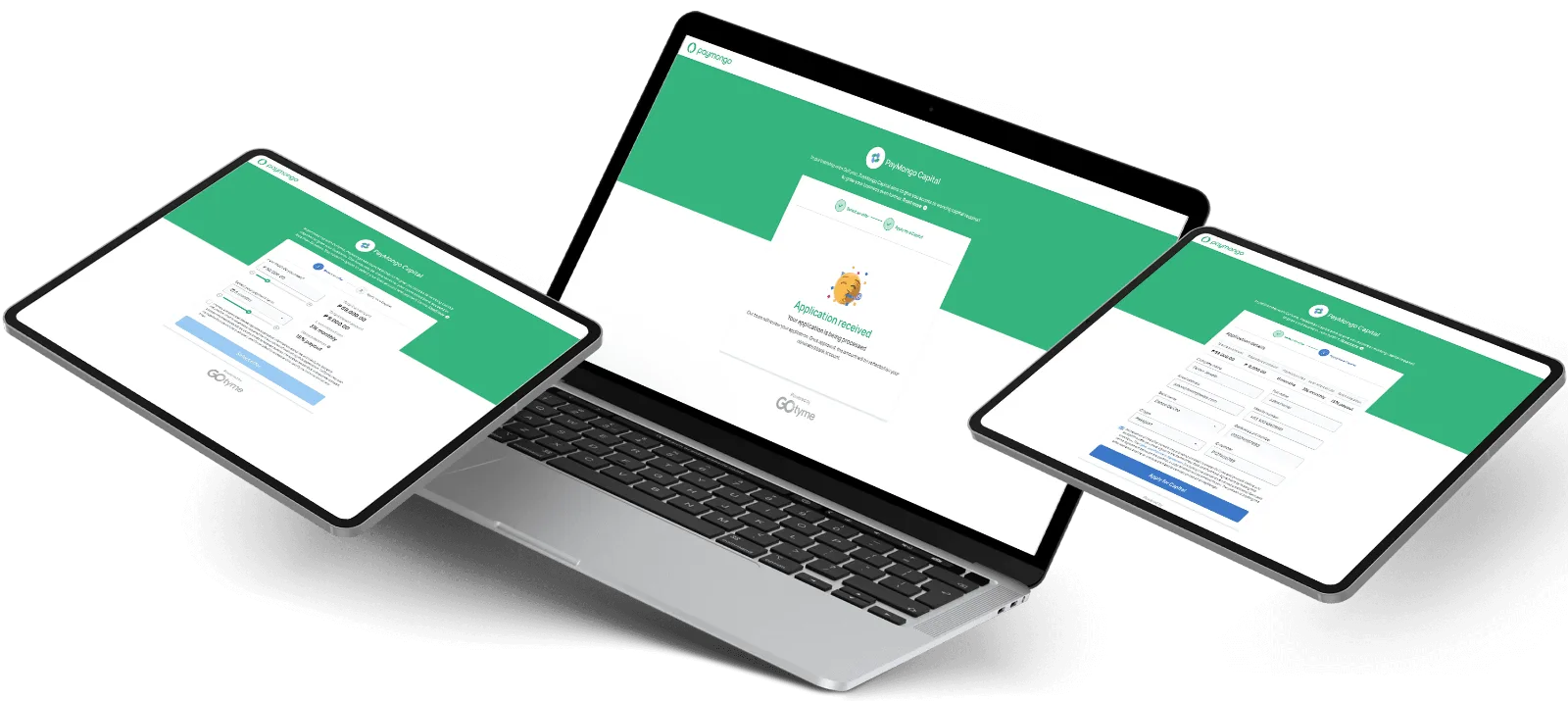
Rigid requirements, slow approvals and fixed repayments were holding small businesses back. We bet that a loan sized to real sales, with automatic repayment and live eligibility, could be flexible and still responsible.
- Role
- Product design and research
- Team
- 1 product designer, 2 UI designers, 1 UX researcher, 1 project manager
- Timeline
- Jun — Oct 2024
- Methods
- Survey of 278 merchants, journey map, workshop, moderated usability tests
. Outcomes
- ₱56M
- Total loan volume
- 293
- Loans taken
- 38%
- Came back for another loan
. What merchants told us
Loans matter. The terms scare people off.
- 0156% of merchantssay loans are essential to survive and grow.
- 02Top barriers.High interest (47%), high monthly payments (37%) and short terms (27%).
- 03Who we designed for.Sole proprietors, especially long-tail and non-selling merchants.
↳ The barrier was never access. It was fear of the terms — so the terms became the interface.
. Where the journey broke
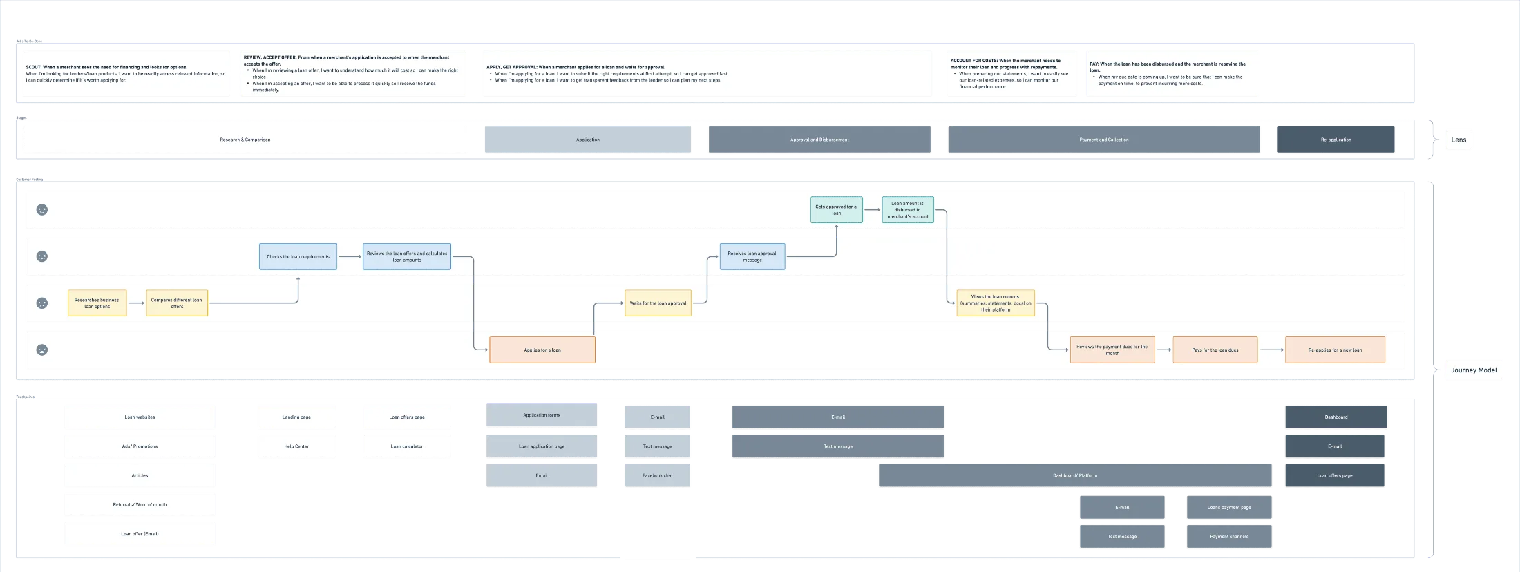
Scout, review, apply, track, pay.
- 01Choosing was hard.Merchants couldn’t tell which loan fit them.
- 02Applying was slow.Traditional lenders asked for piles of documents.
- 03Repaying was blind.Due dates were hard to track, so payments got missed.
. How I worked
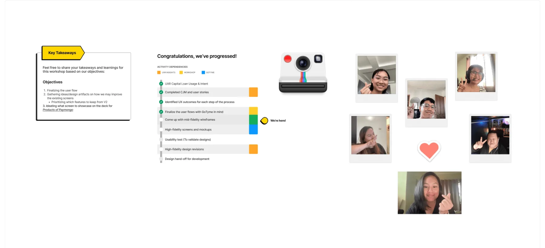
- 01ResearchA survey of 278 merchants.5—7 days
- 02Map pain pointsTouchpoints mapped from survey and interview data.3—5 days
- 03Align the teamA diverge-and-converge workshop with 5–7 stakeholders.3—5 days
- 04ValidateModerated remote tests with merchants who matched the persona.5—7 days
. What shipped
Less paperwork. More visibility.
- 01A simpler application.Pre-filled fields and plain explanations of repayment.
- 02Offers on the dashboard.Clear terms, with progress you can see.
- 03Easier repayment.PayMongo receipts replace bank screenshots, with gentler penalties and rewards for paying early.
. What testing changed
Merchants read loans differently.
- 01Spell out the money.Rates and repayments needed to be crystal clear.
- 02Give them a target.Sales-based repayment made sense, but people wanted a goal to track.
- 03Show progress.They liked the simple dashboard and asked for a progress ring and a counter.
- 04Cut the extras.Amount, rate and allocation mattered. Everything else got trimmed.
↳ Testing rarely tells you to add. Here it mostly told us what to remove.
. Next
Case study 03
Fewer steps between wanting and paying. ↗